
DEFINING YOUR AUDIENCE. Is this a general audience, or a group of professionals? Knowing your audience will affect the kind of language you use, and how detailed about concepts you will need to be.
KNOWING YOUR ELEVATOR PITCH: If the viewer takes away one thing from your presentation, what do you want it to be? You may only have 30-90 seconds with a viewer.
Creating charts, graphs and diagrams is a simple process if you have the right tool. Below is a list of products that will allow you to put your data into an easily digestible form.
| SECTIONS | EXAMPLES |
|---|---|
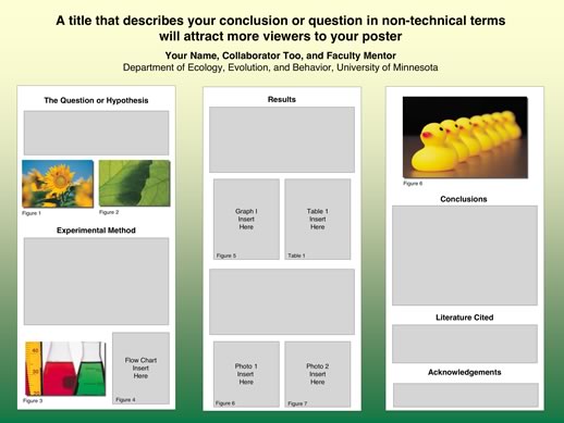
| Title | A title that describes your conclusion or question in non-technical terms will attract more viewers to your poster |
| Introduction | A statement that gives a quick overview of your poster. Include relevant background to provide a context for understanding the central question or theme of your poster. Define acronyms if you use them, and avoid lab jargon. |
| Objectives, Aims, Goals, or Problem | A concise statement of the goal, question, or problem. Include an hypothesis, if appropriate. |
| Methods | A brief description, diagram, or flow chart representing each key process or procedure used to test the hypothesis. |
| Results | Describe the data collected and the methods used to analyze the data. Photographs, tables, or graphs should be as large as possible, easily interpreted, and labeled with a caption or figure legend. |
| Conclusions | Provide a summary, discuss significance of results, and key conclusions. Do the results support or not support the hypothesis? |
| References | Cite key publications in the text of your poster and list the references here. Include sources of any images or other materials used in the poster. |
| Acknowledgements | Thank the individuals, programs, and funding sources that contributed to the research. |
- Title 90-150 point bold
- Author 36-42 point bold
- Section Headings (Sub-titles) 36-54 point bold
- Main Text 28-32 point
- References & Acknowledgements 18-28 point
- 30 point font size will accommodate 250 words per square foot.
- TEXT AND TITLES WRITTEN ENTIRELY IN CAPITALS ARE HARDER TO READ for ease of reading, nothing beats black text on a light background.
Colors and backgrounds should be subtle. Color should highlight, separate, define and associate information. If it begins to compete with your information for attention, then it is too strong. Color works best as a background element, such as a field against which text is set, rather than as a foreground element itself. Colored text is often harder to read than the same words in black. Just setting headings in color does not necessarily mean that they will be more noticeable than the text surrounding them. Small text set in color is hardest to read of all.
Be aware that colors look different on your screen than they will in print. In general, a color will appear lighter on the screen than in print. So, select a lighter color than you think you need for your background if you are using black text.
Free and Legal Image Repositories
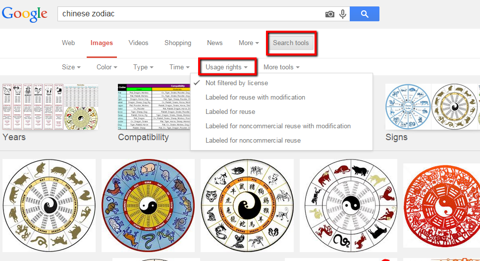
If you are not creating your own images (i.e., a graph, chart or drawing) and are instead looking online for an image to use, you will need to consider the copyright implications. Even images found online have copyright. If you would like to use an image in your poster, you can do so by: Getting permission from the image's copyright owner; Buy images from a stock photo site; Use an image that is in the Public Domain or has a Creative Commons license; Create your own images or take your own photos. The following section details some online image repositories where you can find images that are free to use.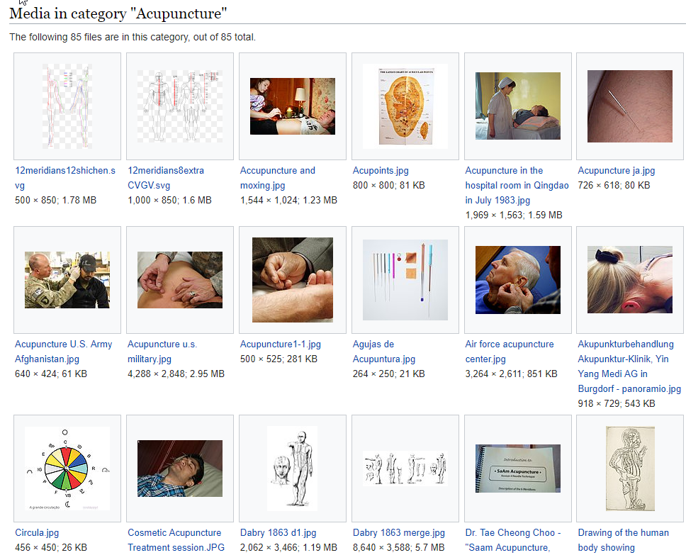
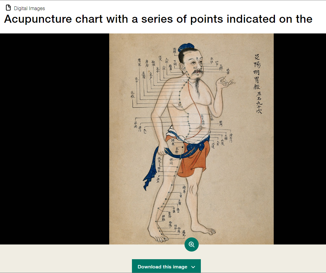


Some images in institutional collections, like the National Library of Medicine's History of Medicine archive, may have unclear licensing terms. You may see the license, "No Known Copyright Restrictions." In these cases, the institution believes the image to be in the public domain. For images from NLM's History of Medicine collection, they ask that if you use an image, to use the following credit: “Courtesy of the U.S. National Library of Medicine, Bethesda, Maryland.”
Create a draft of your poster several weeks before it is due, and send the PowerPoint file to your research mentor, colleagues, and friends and ask for them to send you their comments. Include the checklist (below) to provide your reviewers with a convenient guideline. You can print a miniature version of your poster on letter-sized paper to get a better visual impression of the overall layout, balance of graphics and text, and alignment of elements within your poster. You probably won't be able to read the text or fine details on the letter-sized version, so be patient and proofread your text carefully in PowerPoint.
Download checklist (.pdf)
Checklist adapted from University of Guelph's "Effective Poster Design" http://www.soe.uoguelph.ca/webfiles/agavez/poster
- Is the research objective made explicit and highlighted under a heading such as "Objectives," "Aims," or " Goals?"
- Are the main points explicitly labled (e.g., "Main Points," "Conclusion," "Results")?
- Does the information flow logically?
- Has the content been carefully edited?
- Is the text legible in terms of font choice, size, color and spacing?
- Does the title bar include the presenters' names and is the department or institution identified?
- Is the poster free of curious acronyms and jargon?
- Are the graphics large enough to be seen from a distance of 10 feet?
- Are the graphics attractive and relevant?
- Have figure legends or captions been used to guide the viewer?
- Does the poster have sufficient clear space?
- Are text and graphics evenly balanced, with enough text to explain the graphics?
- Have items been aligned?