
This guide only highlights a few materials, but many resources are available through the library! Try a subject search using Primo Library Search to find more resources.
Disability and accessibility is not a monolith, though we link to a few suggested subject searches, aim for more specificity when searching for resources.
Suggested Subject Searches:
Disability and accessibility is not a monolith, though we link to a few suggested subject searches, aim for more specificity when searching for resources.
Suggested Subject Searches:
For a complete listing of our print and online journal collection, please see our Journal Finder list or you may use Primo Library Search.
Multnomah County Library has an excellent collection of electronic resources, including databases, ebooks, and reference resources. These resources are free to all library patrons, so visit your local branch to get set up with a library account.
Is there a resource you'd like to see added to the guide? Send us an email using our contact form!
The OCOM Library is dedicated to ensuring all OCOM students, staff and faculty have equitable access to the facilities, services and materials that are required for their academic needs. If you require ADA accommodations, please contact the Student Services for more information on services that could assist in your studies at OCOM.
The library has adaptive equipment available to use in the library and for check-out. Please see our Accessbility Support Services webpage for an up-to-date list of available equipment.
The library has adaptive equipment available to use in the library and for check-out. Please see our Accessbility Support Services webpage for an up-to-date list of available equipment.


From Portland Community College: "The Disability History Exhibit was created by Advocating Change Together as a museum quality display. Twenty three beautifully crafted panels bring viewers through an illustrated timeline showing society’s attitudes and how they affect the lives of people with disabilities. Video versions of each panel were created by Portland Community College Disability Services in partnership with our Multimedia Program. The videos feature the voices of our students and are all captioned. Note that an accessible html version of the exhibit is also available online. "
Font sizes for email and documents should be large enough to be legible, at least 12 point or larger.
You can change the default font size of your Gmail by: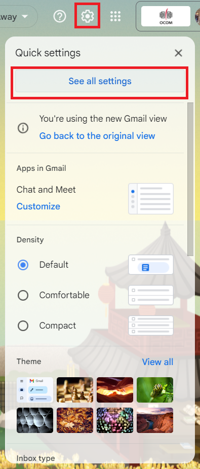
You can change the default font size of your Gmail by:
- Select the Gear icon from your inbox and click on "See all settings".
- In the "General" tab, find the section labelled "Default text style".
- In this section, the second dropdown from the left (with the TT's) will allow you to set your font size.
- Select "Large" and scroll to the bottom of the page to select the "Save Changes" button.
Font types for email and documents should be legible and plain. A sans-serif font will be the clearest to read, such as Tahoma or Verdana.
Sans-serif fonts can be identified by their lack of flourishes at the ends of letters, which can create visual distractions. The default font in Gmail is Sans-Serif, but if you wish to switch to another sans-serif font, you can do so by:
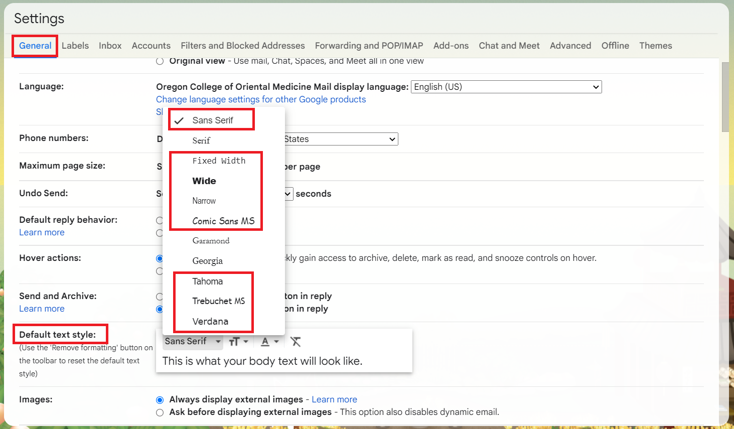
Sans-serif fonts can be identified by their lack of flourishes at the ends of letters, which can create visual distractions. The default font in Gmail is Sans-Serif, but if you wish to switch to another sans-serif font, you can do so by:
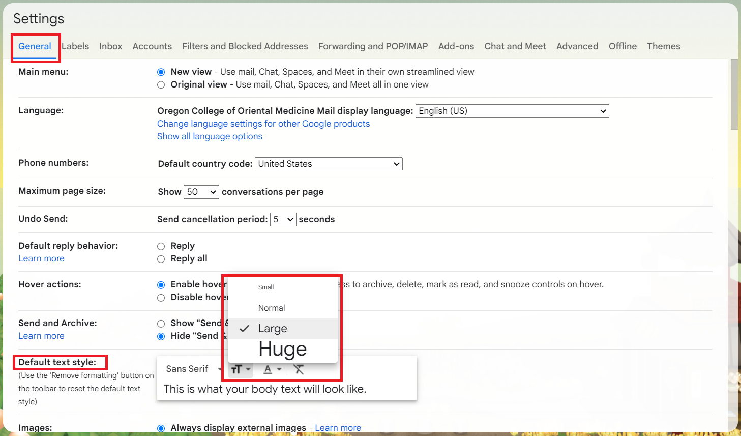
- Select the Gear icon from your inbox and click on "See all settings".
- In the "General" tab, find the section labelled "Default text style".
- In this section, the first dropdown from the left will allow you to set your font type.
- Select a sans-serif font and scroll to the bottom of the page to select the "Save Changes" button.
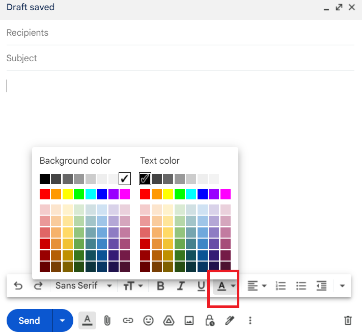
Contrast between the color of your text and the background should be different enough for readers with color blindness to read. Black font on a white background or white font on a black background are good choices to maximize the contrast between the shades, but there are tools that allow you to check your color combinations. Avoid using color alone to convey information or importance, make sure that your written word alone can convey the information you are trying to get across.
WebAIM's Contrast Checker allows you to select foreground and background colors and will show if they pass the Web Content Accessibility Guidelines for normal or large text.
The default for Gmail is black font on a white background, you can change your font color in the settings but cannot permanently change the background color. Background color will have to be set in individual emails if you plan on changing it.
Images can be tricky to make accessible when using Gmail. Not everyone has images enabled for email or it might make their email slow to load. A poster or flyer image within an email might be more visually interesting than a text document, but you lose the utility of being able to search for it within your inbox. Best practices for web accessibility dictates that images should have alternative text (alt text) added to the HTML so that users with screen readers can identify the contents of the image. While other Google services such as Google Docs and Google Slides allow users to add alt text to their images, there is no way to do this within Gmail. You can work around this issue in Gmail by adding alt text to your image in Google docs or Google Slides and then copy and pasting it over.
If you do use images, ensure that the information conveyed by the image is within text as well. If images are needed, make sure that your readers understand how it relates to the content of your email. Consider if you are adding an image if it could be an attachment instead with a descriptive file name.
If you do use images, ensure that the information conveyed by the image is within text as well. If images are needed, make sure that your readers understand how it relates to the content of your email. Consider if you are adding an image if it could be an attachment instead with a descriptive file name.
When you use an acronym, such as Oregon College of Oriental Medicine's OCOM, you should never assume that the recipients of your email know the unabbreviated meaning. The first time you use an acronym, define it, and then you may use the acronym for the rest of your email.
Meaningful hyperlinks and file attachments in your emails help people understand what you are linking them to or giving them access to download.
Hyperlinks should be descriptive and unique. Many screen readers have the ability to hop from link to link, so if every link in your email is 'Click here', 'Click here', and 'Click here', but they go to three separate webpages, that doesn't help the user understand where they are being redirected. It also makes it easier for those without visual impairments to scan through emails full of links to find the information they need.
Email attachments should similarly use descriptive filenames so that recipients have an idea of what file they are downloading before the open it. Many articles and PDFs from the internet come with seemingly jibberish names, so spending the minute to rename them to add deeper meaning is worthwhile. Consider what you recipients need to know about the files you are sending, you may want to include the date, or the type of document it is, as well as basic information related to the subject within.
When naming files, you should use snake_case, camelCase, or PascalCase to differentiate between new words.
- snake_case uses an underscore in between words and is very legible.
- camelCase capitalizes each new word in the filename except the very first word.
- PascalCase capitalizes each new word in the filename, including the first word.